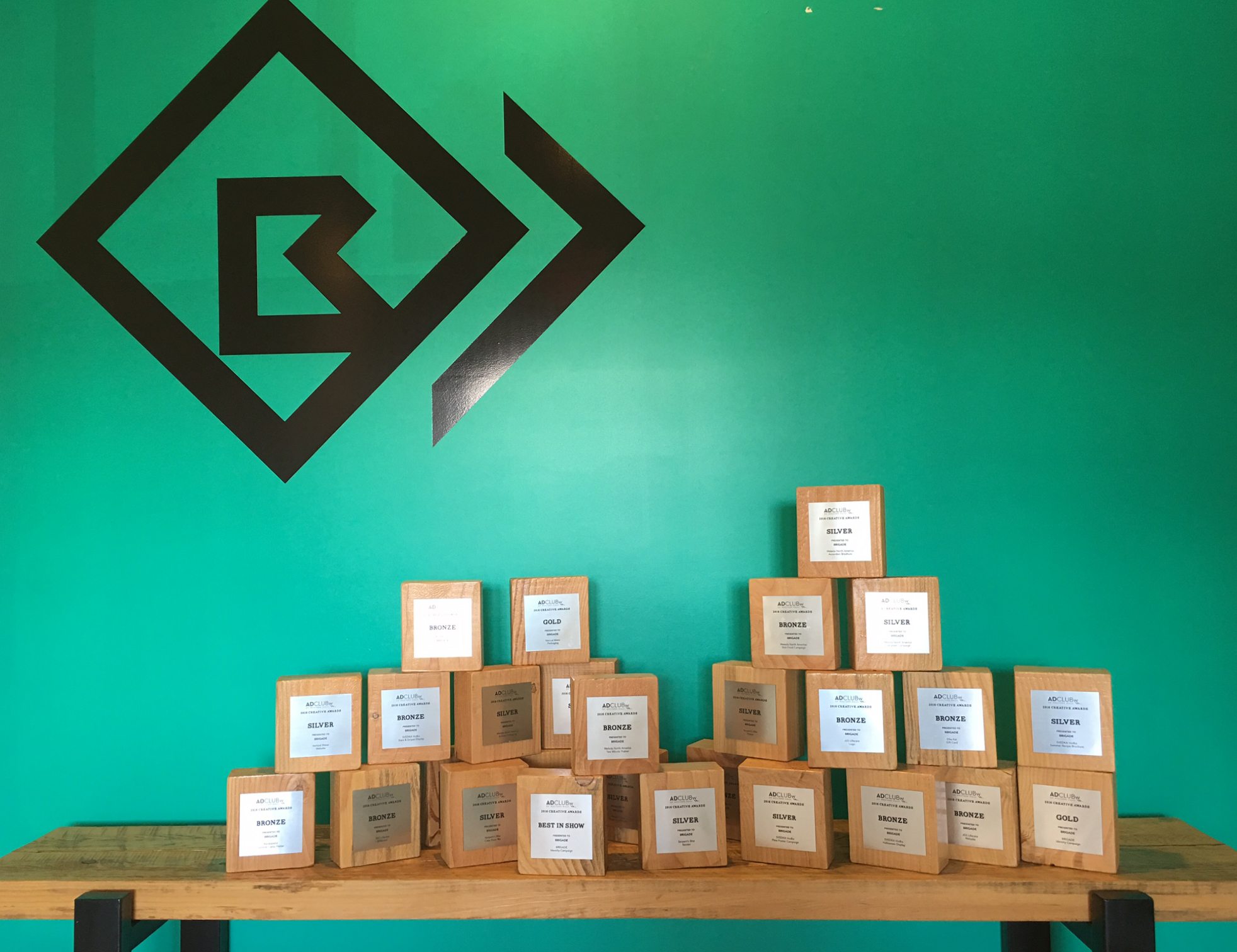
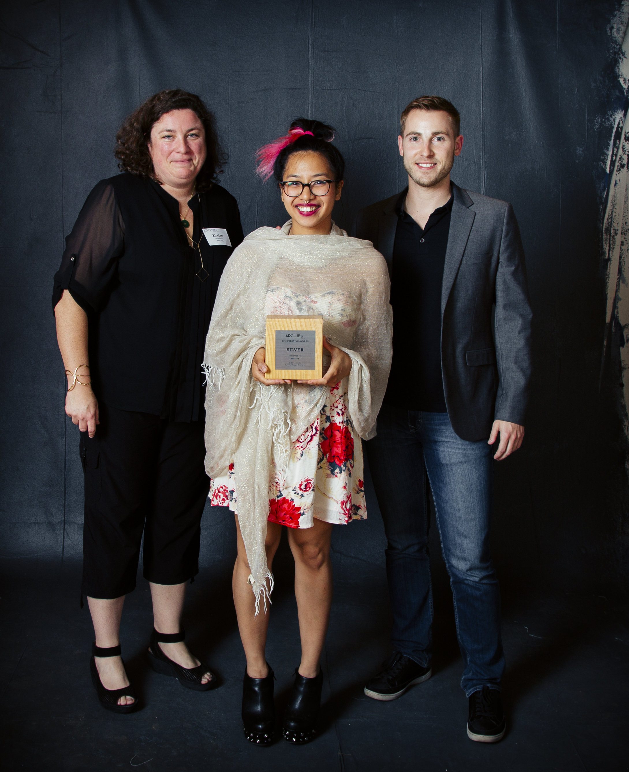
BRIGADE Honored at 2016 Creative Award Show

Hadley firm takes home Best in Show as well as 2 Gold, 12 Silver & 12 Bronze Awards
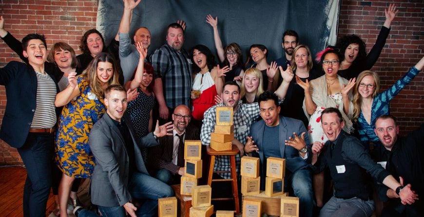
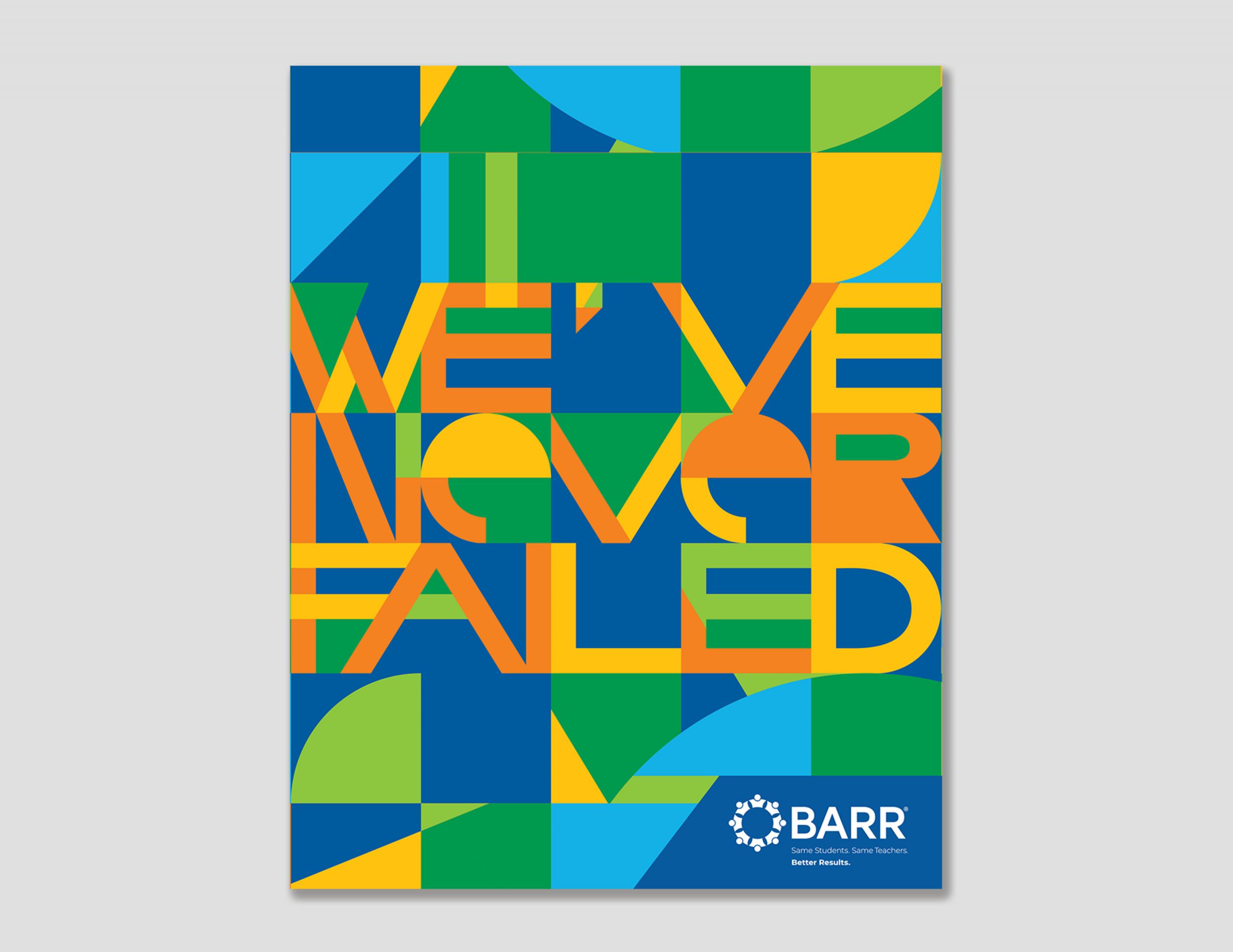
The AD Club of Western Massachusetts held its annual Creative Award Show May 19 at Open Square in Holyoke. During the event, BRIGADE’s work was recognized with 27 awards that evening. BRIGADE received awards for its brand development, design and packaging for SVEDKA, JGS Lifecare, Weleda North America, Elli Kai, Ramblewild, Serpents Bite, Vertical Water as well as BEST IN SHOW for the firm’s Identity Campaign.
The Ad Club of Western Mass is a not-for-profit member organization serving all creatives in the region – writers, designers, printers, agencies, photographers, web designers, marketers and media. It provides networking and social events, hosts professional seminars, recognizes creative excellence through the Creative Awards and hosts the distinguished Pynchon Awards. Above Photo Credit: Stephanie Craig Photography
|
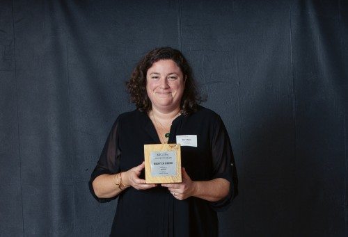
1. Best in Show BRIGADE Identity Campaign
Photo Credit: Stephanie Craig Photography It was an amazing night for all us and we were humbled to be recognized. I’ve never doubted the creativity and genius that our part of the country is capable of – We’ve assembled an amazing team here. BRIGADE turns 10 this summer and we are just getting started! – Kirsten Modestow |
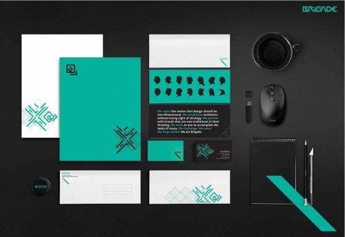
2. Gold BRIGADE Identity Campaign
We ultimately wanted to tell a story about our team and all the components that make us successful working together. Sometimes a simple design can tell a detailed story. – Dave |
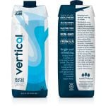
3. Gold VERTICAL WATER Packaging
|
|
4. Silver SVEDKA Pride Poster Campaign
Inspired by the way in which equality is evolving in the United States, we created a powerful interpretation of the pride flag that envelopes a ‘Pride Edition’ bottle of SVEDKA Vodka. The composition pops off of a stark white background while the abstracted flag shape changes direction to create visual tension and energy. In addition to the visuals of this campaign, we wrote custom copy and headlines. |
5. Silver SVEDKA Summer Recipe Brochure
We created a comprehensive cocktail recipe book for SVEDKA Vodka’s 2015 Summer Program, #HowToSVEDKA. While most cocktail books are a simple index of recipes, the client wanted this book to feel more conceptual. We ultimately created a #HowTo guide meant to draw casual consumers into the world of complex cocktails. In this book, we combine bar and bartender visuals (with extensive Photoshop work), our own original ‘Tips & Tricks’ copy, and an index of simple ‘Required Tools’ iconography to make the consumer feel as though they are actively being instructed by a master mixologist. |
6. Silver SVEDKA Flow Poster Campaign
The FLOW campaign was a chance to demonstrate BRIGADE’s story telling through flavors, cues and sophistication. The series of images live beautifully together. – Dave |
|
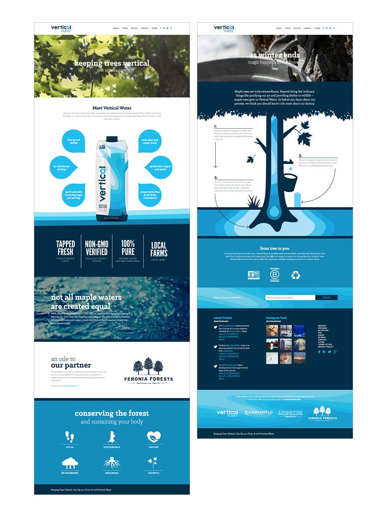
7. Silver VERTICAL WATER Website
We used the website as an opportunity to bring Vertical Water’s story to life. From celebrating the process, to explaining their positive impact on the environment as well as on the maple industry–there was a lot of information that we wanted to share. We streamlined this information into digestible chunks so that the user can effortlessly take in the pages of new content. |
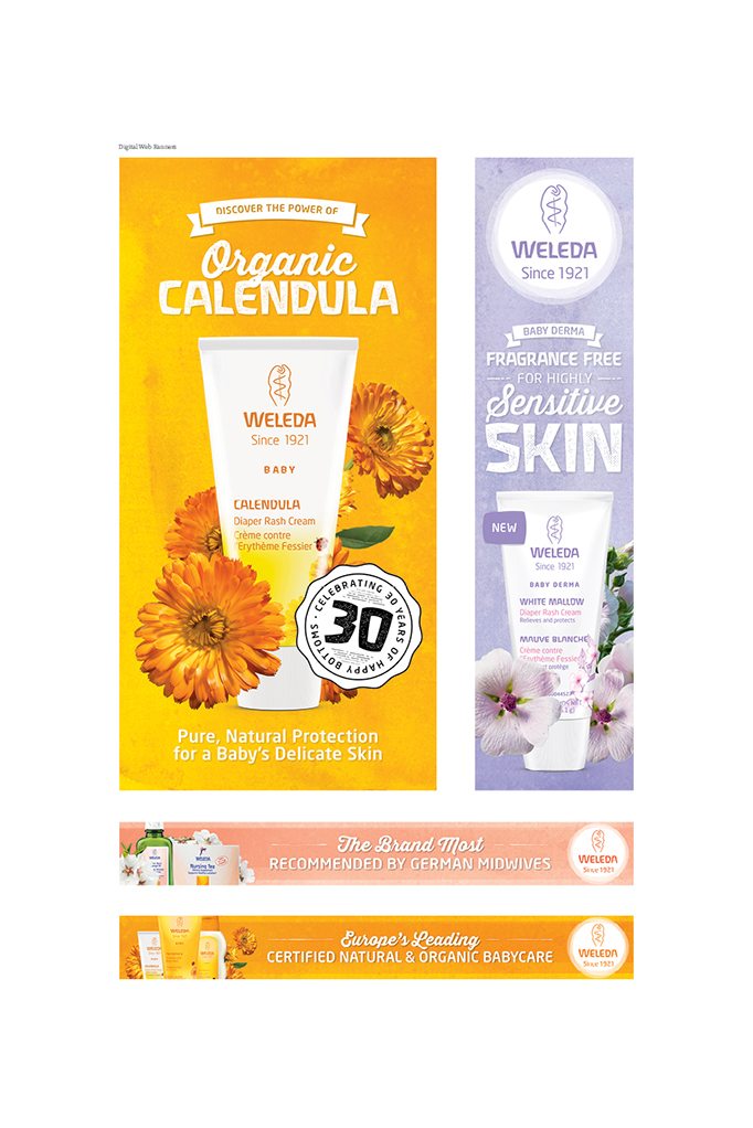
8. Silver WELEDA Evergreen Campaign
We really leveraged the watercolor and plant imagery for a visually arresting set of web banners. – Kristen |
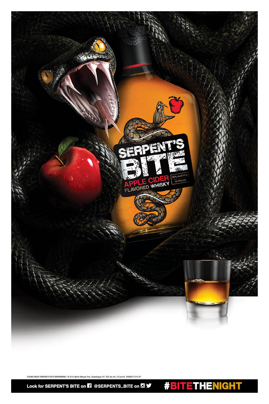
9. Silver SERPENT’S BITE Poster
The poster was the initial key image for the POS and was a challenging assignment but extremely rewarding in the end after we had it rendered out and finalized across all the materials. – Dave |
|
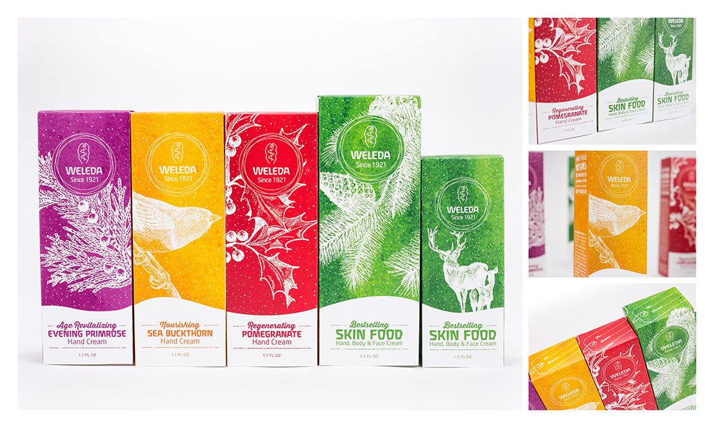
10. Silver WELEDA Holiday Packaging
It’s a rare thing when integrity of your original vision remains intact at the end of a design project. This is one of those times! This project went off without a hitch. –Kristen |
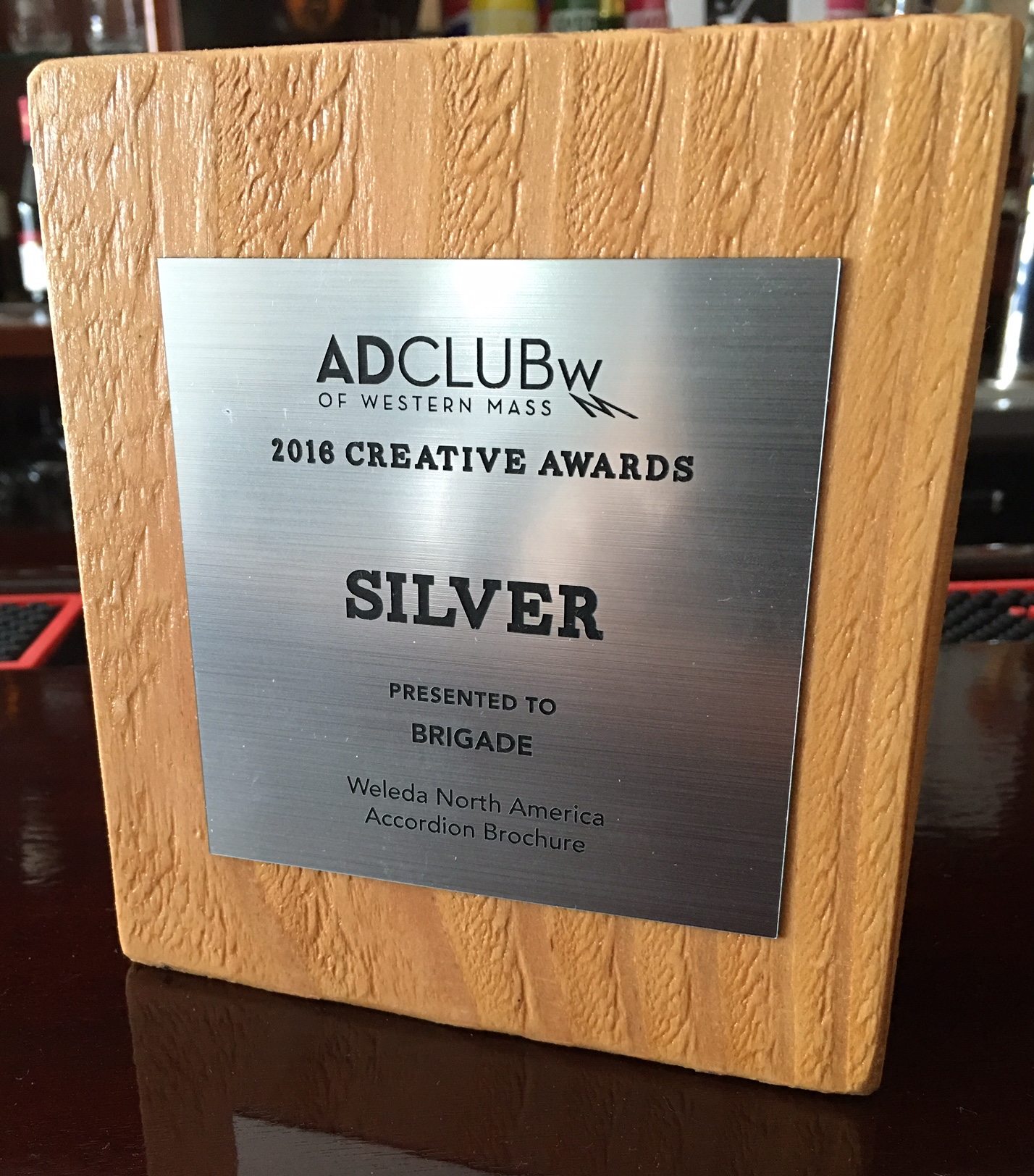
11. Silver WELEDA Accordion Borchure
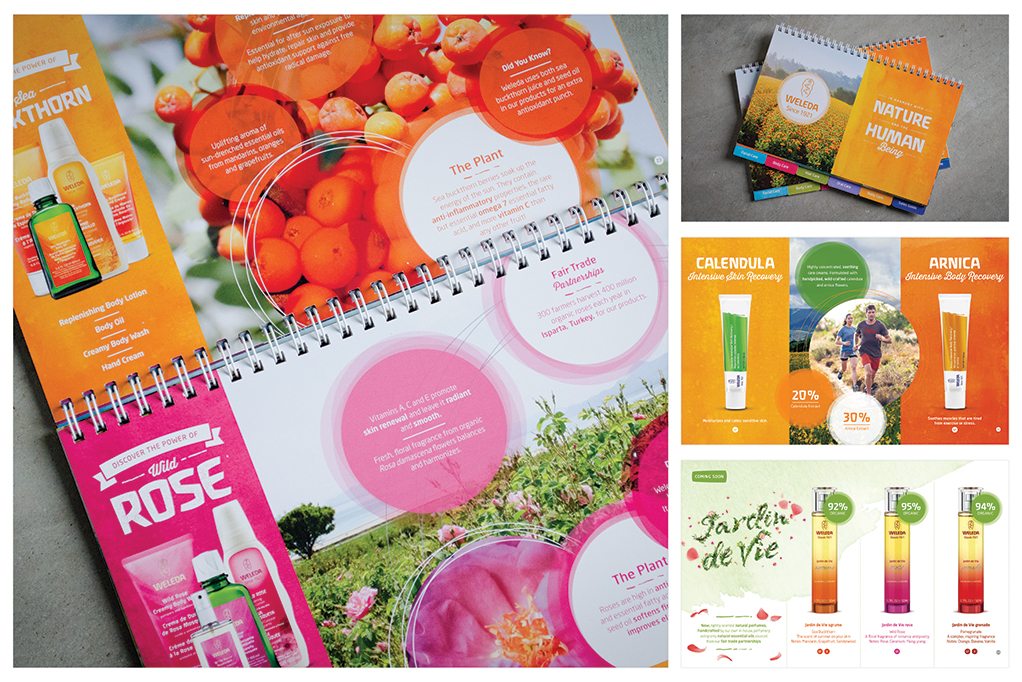
We designed this product-forward piece as a tool for the Weleda sales force – it serves as a colorful introduction to the brand, highlighting key product attributes and emphasizing the company’s commitment to natural ingredients, environmentally-friendly sourcing and fair-trade partnerships. |
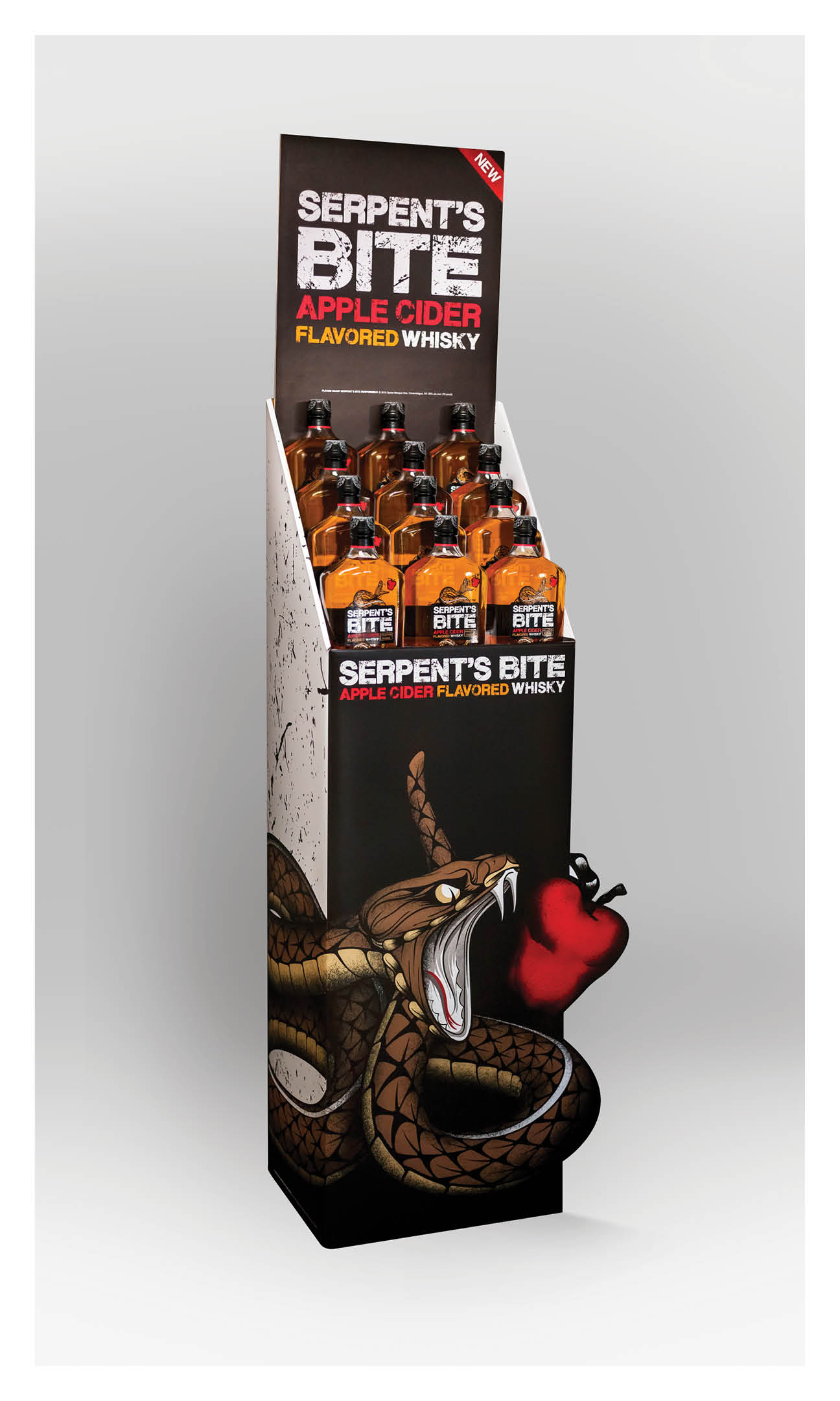
12. Silver SERPENT’S BITE Case Floor Bin
Like the SERPENT’S BITE 50ml Display Unit, this floor bin is meant to draw as much attention to the new brand as possible. Once constructed, the resulting display maximizes brand impact without requiring a large amount of product. |
|
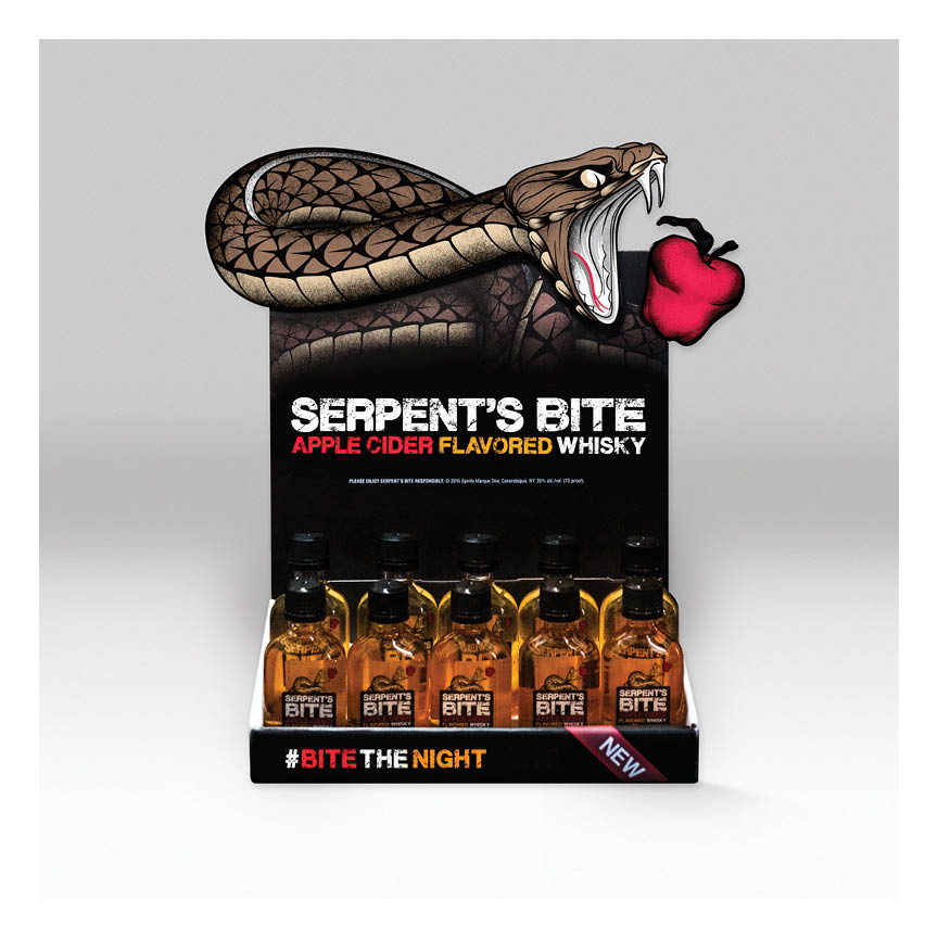
13. Silver SERPENT’S BITE Single Counter Unit
This small display has a big role. Because SERPENT’S BITE is a shot brand, 50ml nips are massively important to the brand gaining traction at liquor stores. Made from die-cut cardboard, this display is meant to sit on the counter next to the cash register to encourage new consumers to experiment with the brand. To command as much attention as possible, this piece was constructed and composed to make the serpent feel as though it is lunging off of the display and into view of the consumer. |
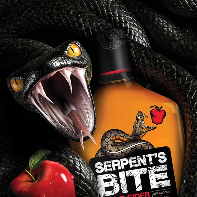
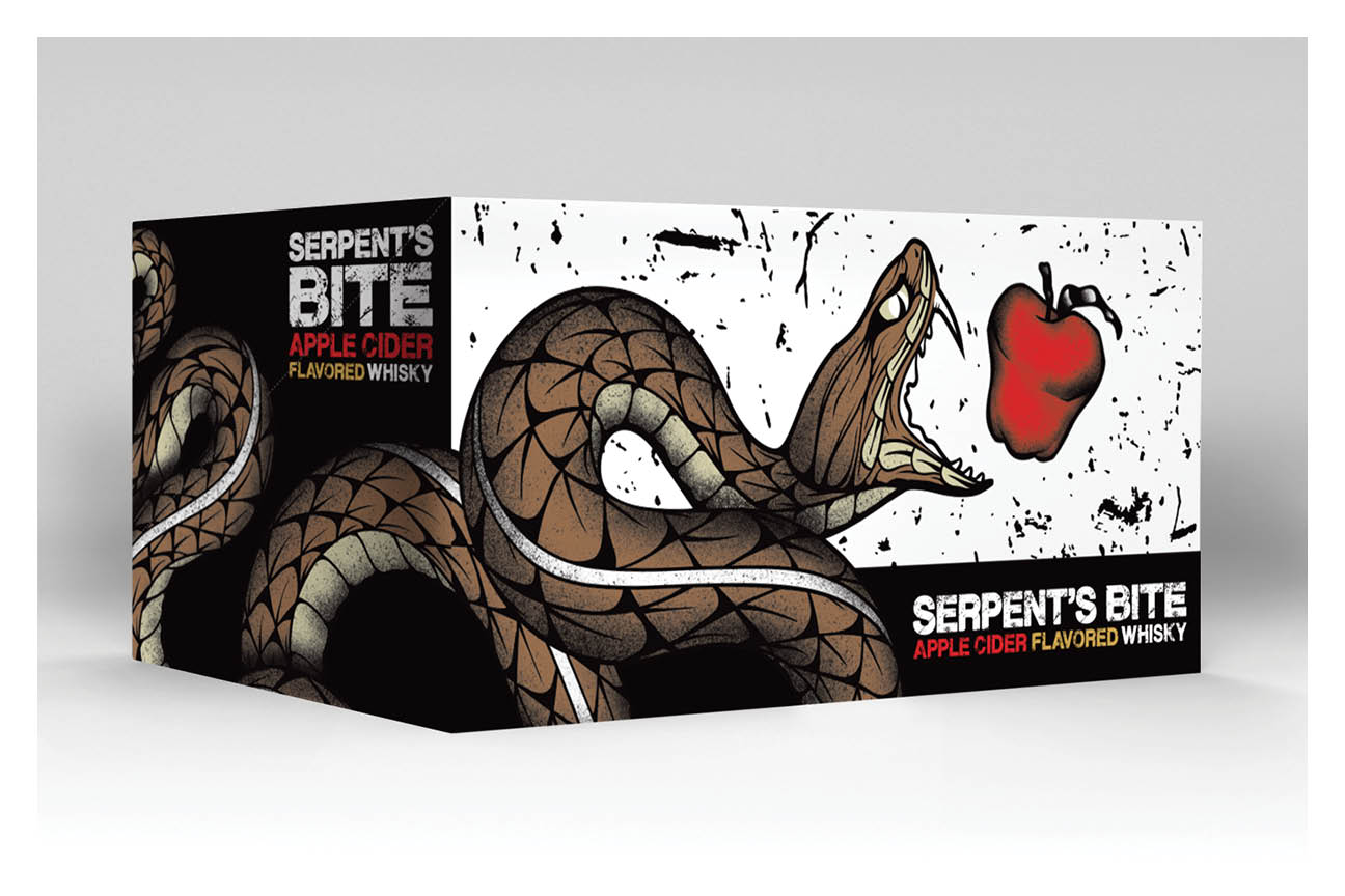
14. Silver SERPENT’S BITE 3D Render
From concept to sketch to stunning 3D render, we were responsible for developing the artwork that would launch a brand. We created a stunning key image for the all-new whisky brand, SERPENT’S BITE. Since SERPENT’S BITE does not have the historical cache that other whisky brands leverage in-market, we were challenged with defining an entirely unique look and feel for the brand as it launched onto the national stage in 2015. As a ‘bad-ass’ brand centered around shots, the tone of our original imagery was moody, dark, and masculine. We wanted it to feel as though the serpent was protecting the bottle and lashing out at the viewer. With a key concept and sketch in hand, we combined forces with our favorite 3D renderer and spent months studying snake anatomy, rendering apples, and photographing textures to ultimately create a spectacular 3D visual that brings the brand to life in trade ads, point of sale, and digital media. |
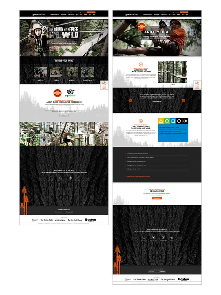
15. Silver RAMBLEWILD Website
This was one of our first forays into the world of NOT using stock photography. What a challenge! It was fun to hire a photographer and help art direct a shoot. Certainly an experience to remember. We created unique landing pages that appealed to the many different target audiences of Ramblewild. – Justin |
|
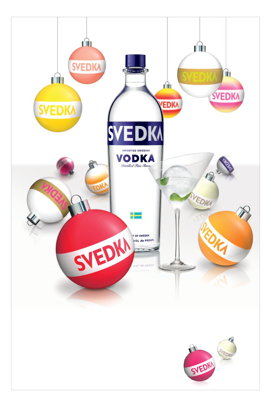
16. Bronze SVEDKA Holiday Poster
We were asked to create and execute a fun and whimsical national holiday point-of-sale campaign for SVEDKA’s flavor lineup. Updating our concept for the 2015 season, we created a poppy, colorful, and fun interpretation of the holidays. We leveraged the color palette of SVEDKA flavors and rendered playful, somewhat abstracted ornaments that retain the brand’s iconic white band. Rather than placing these ornaments around a tree, we let them pop on a clean, white background dominated by a heroic bottle of SVEDKA’s flagship product – 80 Proof. |
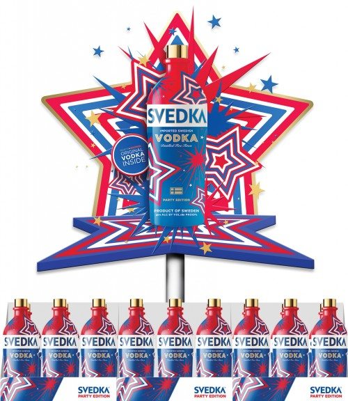
17. Bronze SVEDKA Stars and Stripes Display
Each year, SVEDKA creates a limited ‘Party Edition’ bottle to celebrate summer parties and American holidays. For 2015, we developed a beautiful dimensional display meant to celebrate this bottle and help it stand out in retail stores. We used cardboard construction and strategic use of perspective to emulate depth and create a display that had a larger visual impact than its size would normally allow for. |
18. Bronze SVEDKA Halloween Display
Photo Credit: Stephanie Craig Photography We wanted to create a fun display that would help SVEDKA Vodka stand out in the crowded Halloween retail environment. The resulting display is large, dimensional, and double-sided to maximize impact and command attention. And if you look carefully, you’ll notice that our ghosts are lushes. – Dave |
|
19. Bronze JGS LIFECARE Logo
We were tasked with creating an identity that celebrated Jewish culture without playing the hand too heavily toward Jewish iconography. Various symbols were explored in a wide gradient of obvious-to-ambiguous – which is a fun challenge. The final mark strikes a nice balance, expressing many parts of the JGS story and mission in a clean, simple logo. – Thom |
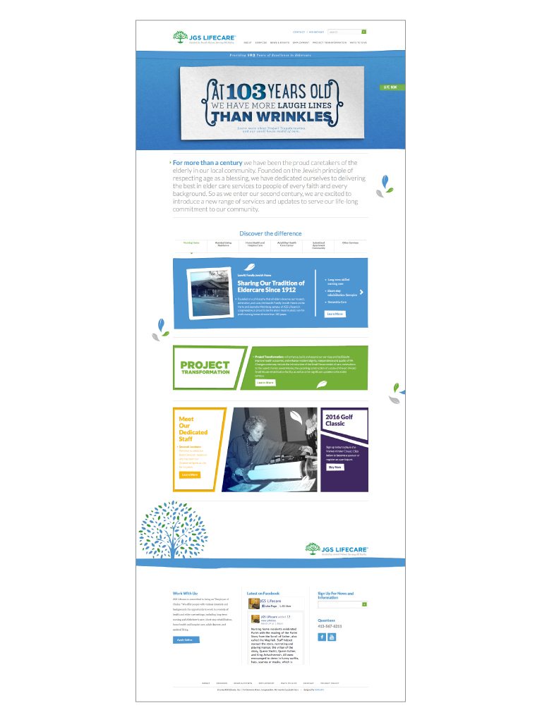
20. Bronze JGS LIFECARE Website
How do we create something artful and fresh in the field of eldercare? We tap into the much-loved Jewish tradition of paper cutting to create a website that’s both informative and delightful to navigate. – Cate |
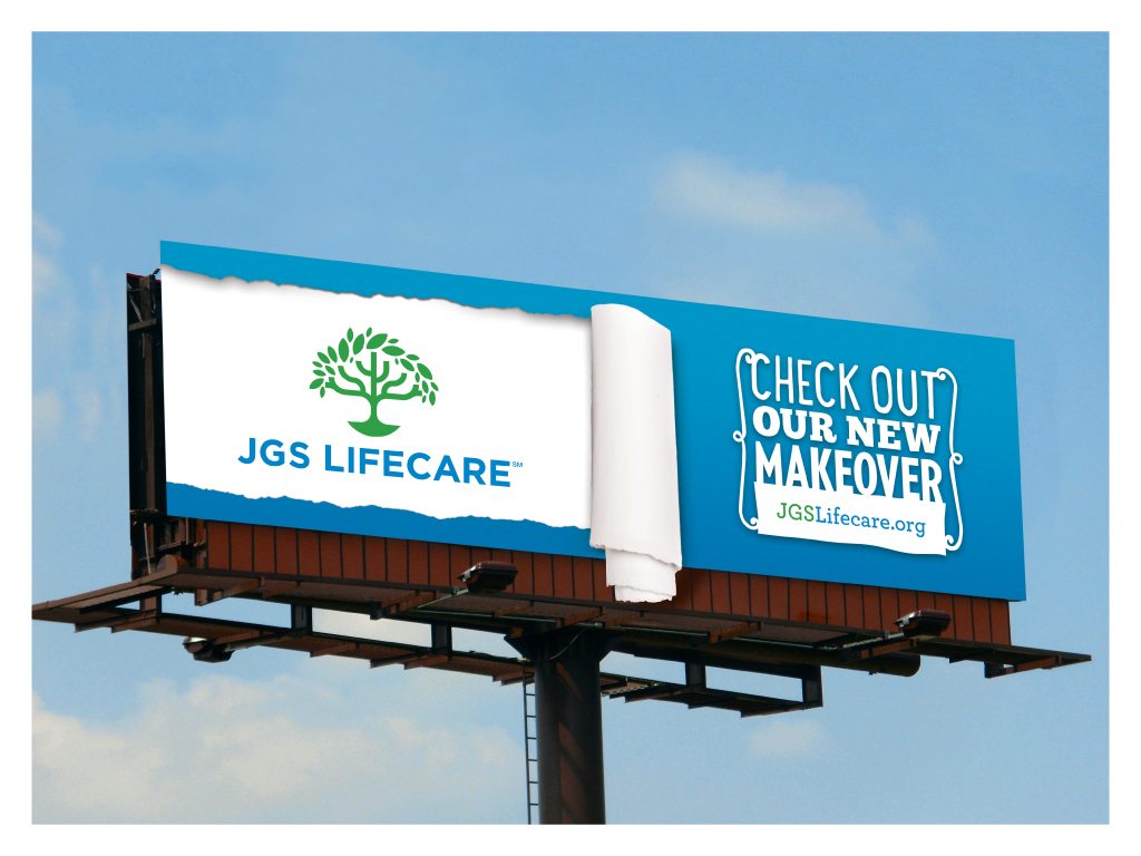
21. Bronze JGS LIFECARE Billboard
One of the challenges with this design was to construct an overhang to illustrate the “rip” falling below the actual billboard. It was great to see the billboard completed without any issues. And big-ups to Meghan who would snapchat me that billboard every time she passed through to CT! – Steve |
|
22. Bronze WELEDA Two Minute Trainer
This extensive, all encompassing manual was a huge feat with an amazing outcome. We worked hard to represent their entire product line while also bringing a fresh, fun look into the trainer. – Meghan |
23. Bronze WELEDA Skin Food Campaign
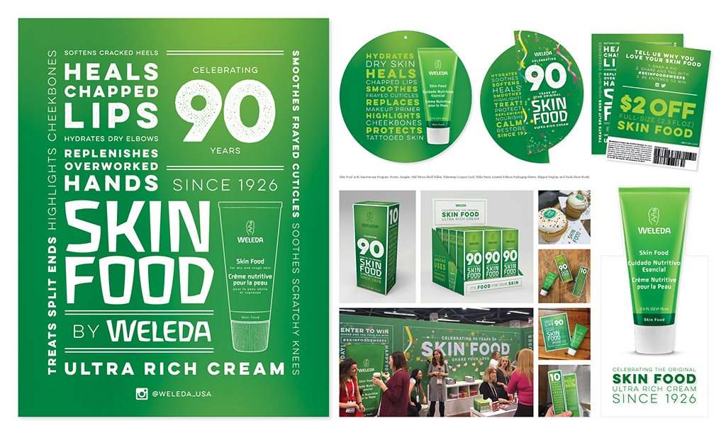
Even though Skin Food looks great (for 90 years old), everybody needs a little refresh from time-to-time. The challenge here was to maintain the integrity of the original packaging while subtly updating the look. A little nip here, a little tuck there…I think we nailed it. – Kristen |
24. Bronze ELLIE KAI Gift Card
Photo Credit: Stephanie Craig Photography This was not only a gift card but a great way for customers to get to know the brand. – Meghan |
|
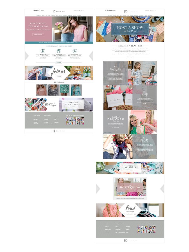
25. Bronze ELLIE KAI Website
After months of designing content, wireframes, and pages it’s quite an achievement to see both our vision and EK’s vision come to life in this beautiful and thoughtful website. – Cara |
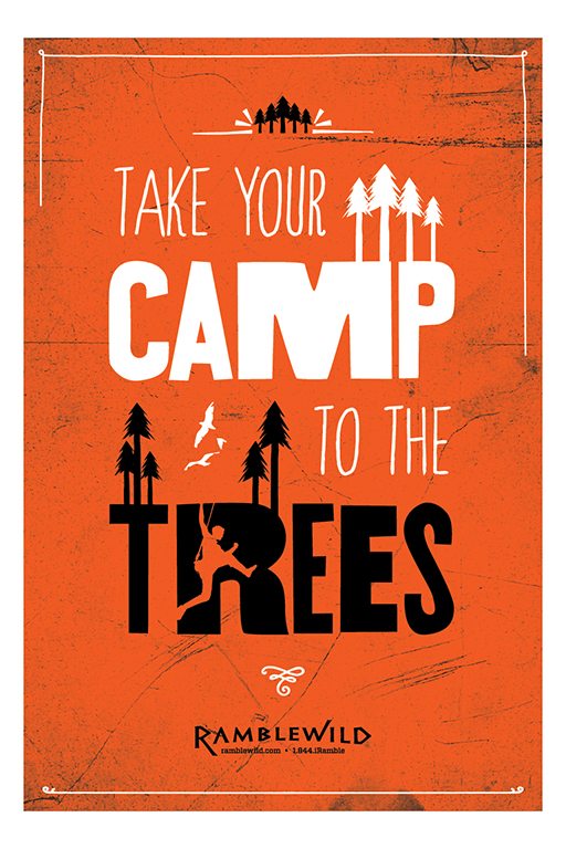
26. Bronze RAMBLEWILD Summer Camp Poster
This piece made great use of the hand-drawn font and custom illustrations developed for the brand over the previous 2 years and combined them both into an eye catching and fun poster. One of my favorites. – Jess |
27. Bronze SERPENT’S BITE Shipper
Though they are frequently under-valued, shippers often make up the majority of branded displays across the country. Because of this, we wanted to develop a smart and visually dynamic shipper that could grab attention in a variety of settings. We created custom artwork to create a serpent that wrapped around the shipper from panel-to-panel. With this composition, store owners have the ability to turn the shippers into point of sale by aligning different panels to create custom displays that can scale depending on available retail space. |
 This was our first time designing for a tetra pak and there were so many obstacles to over come. We learned a lot and were able to create something that looking amazing and accomplished all of our goals for the project. – Joe
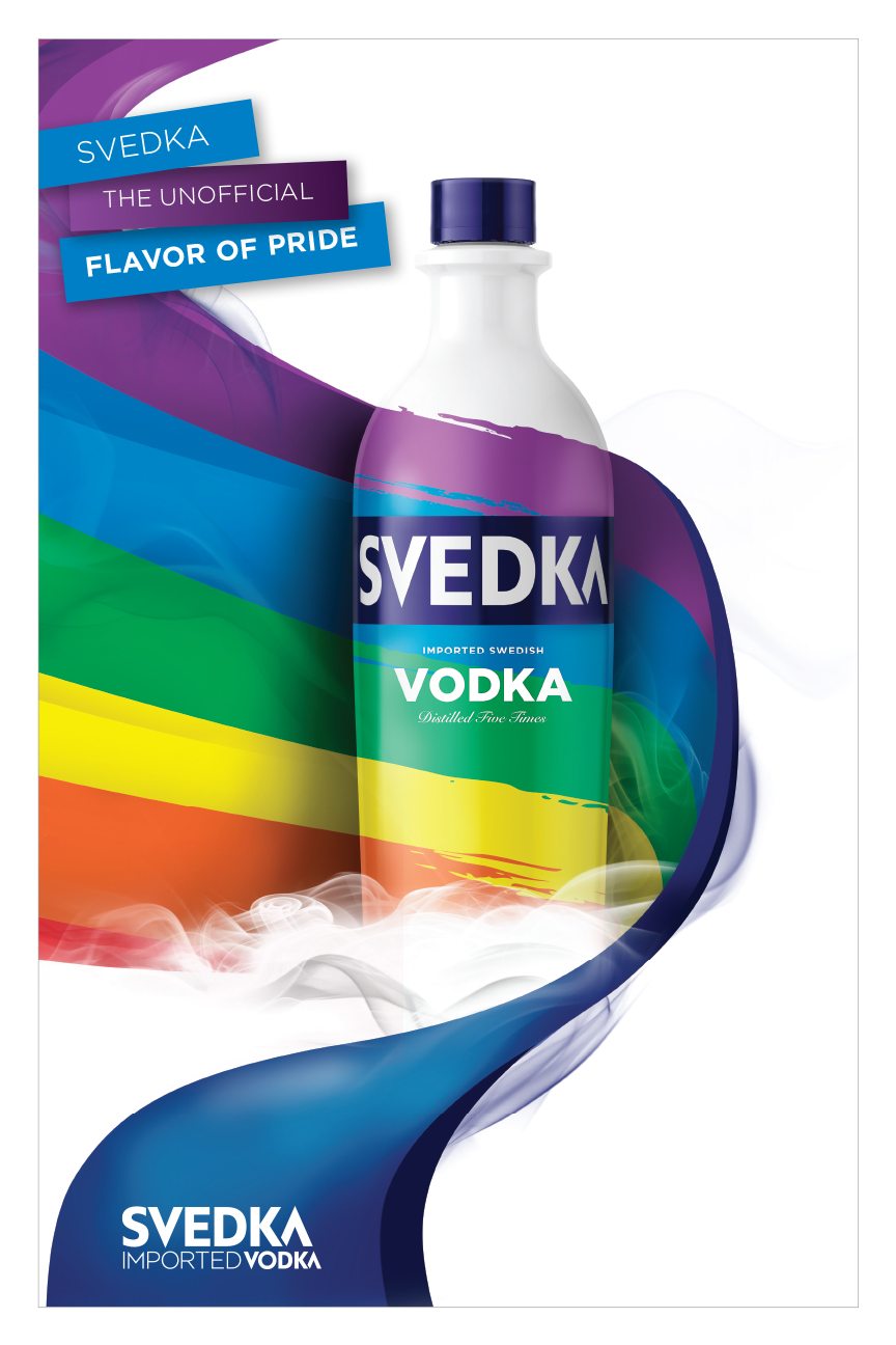
Congratulations to all the award winners!