Wholesome Identity Gives All-Natural Snack Category a Healthy Presence
As retail spaces become increasingly saturated, it is that much more difficult for a product to stand out amongst its competitors, especially in the constantly evolving “Healthy Snack” category. BRIGADE combats this by using its unique personality and strategy to impact the way their clients are seen by consumers.
Frontier Snacks has found their niche in the natural, healthy snack category, which comes with a lot of baggage and complications. In an industry that has reinvented itself overnight, BRIGADE found that their inexperience in healthy snacks was a plus, and drew in clients wanting a fresh perspective, rather than the stale designs that no longer represented their brands.
BRIGADE has also found that a creative way for their clients to compete in the healthy snack aisle is to build an identity that relates to their customers. The word identity has changed over time, and has applied itself to companies and products in a way it had only done with individuals in the past. Companies can no longer sell a logo or a package to consumers. They have to sell their story to gain any traction.
“We work along the lines of what I call the “Six Foot Rule” or the “Twelve Inch Rule,” explained Executive Creative Director, Kirsten Modestow. “The idea is that if I’m pushing my shopping cart down a cluttered aisle, I need to see something that pops off the shelf. Once I pick it up, I want to be rewarded for my decision. I want to be drawn into the story more. All products want to have shelf presence.”
It is with this mindset that BRIGADE creatives reinvent the look and feel of their client’s brand in order to accurately convey the source and benefits of the product.
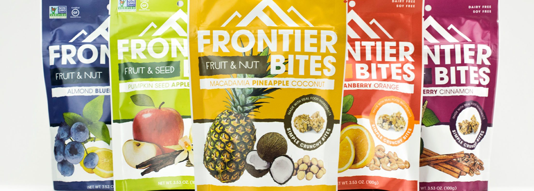
When Frontier Bites, a granola type snack product, approached BRIGADE to help them rebrand several years ago, the agency first did their research on competitors. They sought other products labeled as a healthy snack that also had the same sugar content as Frontier Bites, and sampled them all. What they found, was that the nutrition labels only accounted for the amount of sugar in each product, but not the quality or source of sugar it contained. For example, they came across a kid’s healthy snack that tasted like candy, likely because it came from a natural sugar source, rather than sugar from fruit, like Frontier Bites. This completely alters the taste. The challenge was then to try and appeal to the right audience that wanted a truly healthy snack, not a candy-like substitute. One way around this was to include a glycemic index callout in addition to a non-GMO verified stamp and list all-natural ingredients on packaging.
“The average consumer is more educated and knows how to read labels better than ever before,” said Modestow. “Could you have mentioned a glycemic index on a label a few years ago? I would say probably not.”
Now, Frontier Bites has grown, and is looking to introduce new products, while still keeping the brand clear and consistent in a landscape that has significantly shifted since their last rebranding and packaging efforts. BRIGADE’s Associate Creative Director Joe Marden was tasked with giving Frontier Bites new shelf presence, while still retaining familiarity to the consumer.
Considering the average customer and their needs and wants in snack products goes a long way in establishing appeal and benefits for consumers and their families, something Joe had to take into account.
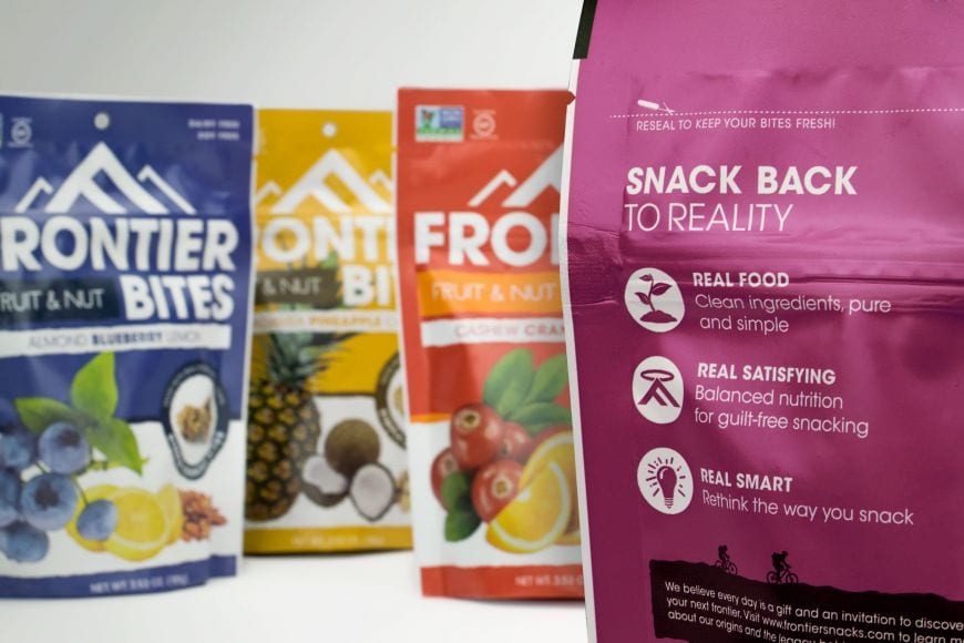
“With increasingly busy schedules and active lifestyles, consumers are looking for ease on the go and functional packaging to complement their snacking habits,” he noted. “They’re getting smarter and are looking for transparency with less noise and distractions from what is important to them. Also, consumers today think of the products they purchase as extensions of their values. They want to know the beliefs and principles of the companies they are supporting by purchasing their products.”
One of Joe’s major challenges was the idea that the snacking category is filled with products claiming to be all-natural—many of which are misleading.
“Frontier Bites are made with only eight real ingredients,” explained Joe. “They can legitimately make that healthy claim, but it’s so overused and over saturated in this category that it doesn’t really mean anything anymore. We had to figure out another way to clearly show the consumer that this is a healthy, all natural snack.”
While researching other food products, some even outside of the snack category, he found that while many did employ the all-natural narrative, they also used warm, natural colors on packaging to cognitively influence the customer’s perceptions of those claims. He also paid close attention to how other products handled new flavors and subcategories within the context of branding.
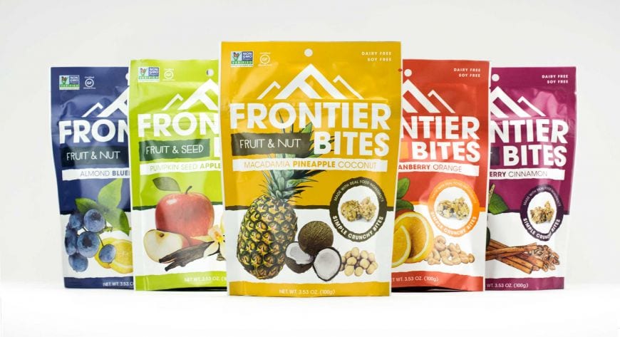
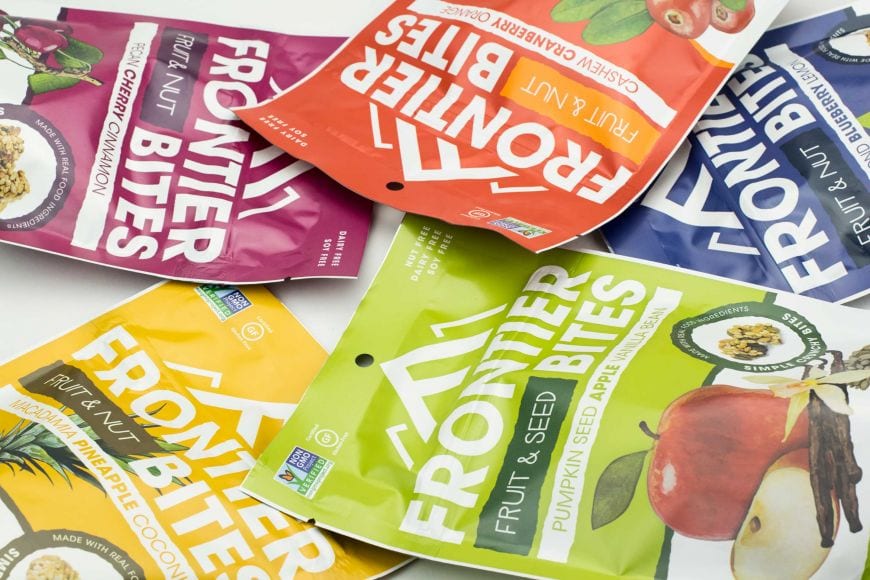
Once the team knew what everyone else was doing, they made a conscious effort to design something completely different for Frontier Bites. First, since the product’s hallmark is that they are made with recognizable ingredients, the BRIGADE team displayed the three main ingredients on the front of the packaging, so the consumer is able to clearly see what they will be eating. The wording and narrative on the package also supports a healthy message by talking about the real ingredients, using words like ‘simple’ and ‘balanced,’ and introducing a new way of snacking. Joe and team also used slightly desaturated colors that were still bright, but had a more natural matte look and feel, a clever way to stand out from the competition.
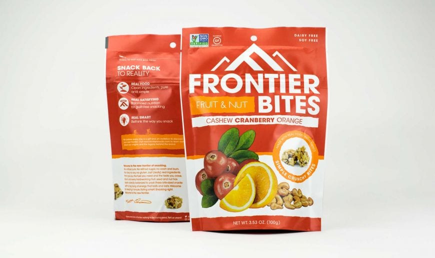
Frontier Bites also opted to switch from clear bags to metallic ones, which would increase the shelf life of the product. The catch was that the metallic bags couldn’t have a window for consumers to see what the product actually looked like.
“We had to solve that with imagery,” Joe said. “We introduced a circle graphic that works as a callout on the front of the bag to showcase the product and separate it from the other messaging on the bag. Also, we placed other product shots on the back of the back around the story and ingredients panel.”
Finally, the team solved the subcategory problem by calling the products Frontier Fruit and Nut Bites. This allows the brand to add other categories as needed. The newest addition is Frontier Fruit and Seed Bites. For the design, the BRIGADE team wanted to keep the boldness of header on the old packaging, while also keeping it flexible for shorter or longer subcategory names. Overall, the ingenuity in the packaging lets the consumer know instantly that the snacks are bite sized, made of fruit and nuts, and have real ingredients in each bite.
One concern of working with and in the healthy food industry is the risk of companies stretching the truth of how healthy their snack really is, or simply not providing the quality product they claim to. This can be challenging to any designer trying to not only brand a product, but also take responsibility for honestly informing consumers.
“Our clients coming in through word of mouth are genuine,” Modestow noted. “They have found a niche and developed a phenomenal product. The right client for us has already been in the trenches making their product quietly behind the scenes. They know they have a good product that’s solid and authentic before they spend money on design. I’ve found that when people come in here looking for design to help them further develop their product, we have a problem.”
It’s the ingenuity of BRIGADE and the authenticity of clients, like Frontier Bites, that make for a “naturally sweet” partnership.
About the author: Alex Lyman is a multimedia journalist, public speaker, social media enthusiast and blogger. Learn more about her here or follow her on Twitter @alexlyman89.