BRIGADE builds dynamic brand for Berkshire Flyer: direct rail service from NYC to the Berkshires
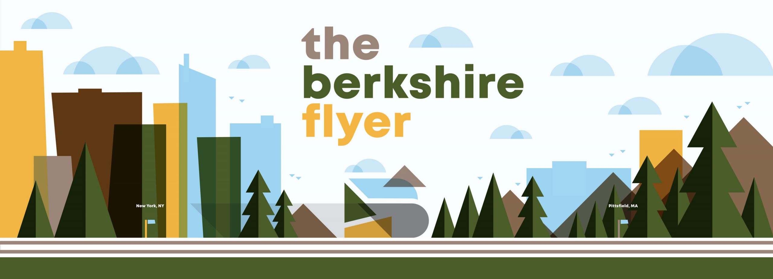
BRIGADE created a responsive logo and identity for Berkshire Flyer, an upcoming direct rail service to attract new tourism from NYC to the Berkshires.
The Berkshire Flyer is moving forward. The new weekend rail service will run directly between New York City and the Berkshires in Massachusetts, bringing an eager new group of visitors to a celebrated cultural destination. Funded by the Massachusetts Department of Transportation and organized in association with Amtrak, a pilot program for the train is set to begin in June 2020. BRIGADE was engaged by 1Berkshire — the economic development agency of Berkshire County — to develop a compelling identity for the new service that would stand out in NYC and help attract a new generation of Berkshire travelers.
While our specific assignment was to brand a train, we knew from the outset that we had to build a larger identity that generated fresh interest in Berkshires. Through careful research, we defined insights and opportunities that the train could leverage to draw a new audience to the region. These travelers are young, primarily mid-late Millennials and early-mid Gen Xers. They’re based in the New York metro area, mainly car-free, and value impactful cultural experiences. This audience defined the style in which we created the Berkshire Flyer identity and strategized how it could be marketed.
Typically, the visual identity for a form of transportation reflects the basic mechanics of how it works: a train engine, a ticket stub, and transit arrows. To avoid this more literal interpretation and appeal to our target audience, we explored something broader, positioning the Berkshire Flyer as a form of access to a place known for its cultural depth and strength. We aimed to create a mark that embodies the art, culture, and experiential prowess that has made the Berkshires a celebrated region — and speaks to an adventurous new demographic.
“For a long time, the Berkshires were largely associated with picturesque Americana,” said Robert Parker, Director of Creative Strategy at BRIGADE. “But in the past 30 years, the region has developed an edge and a hushed reputation for being the next big thing in arts and culture. It’s home to one of the largest contemporary art museums in the world, and there’s this sudden influx of people moving there from San Francisco and Brooklyn. When people go to the Berkshires, I think they feel like they’ve found something special, real, and undiscovered. We wanted to capture that with this identity.”
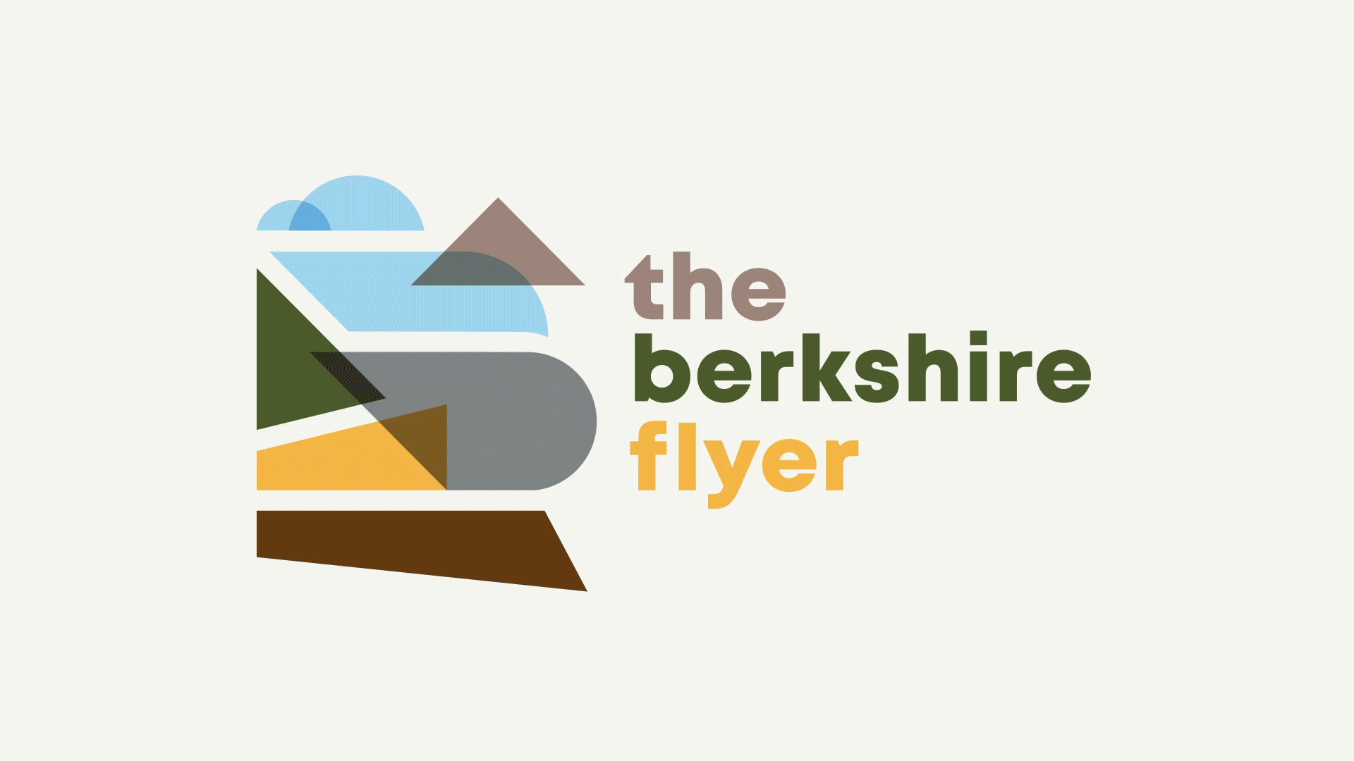
The ultimate identity embraces an abstract, artful approach. Simple geometric shapes and colors inspired by the mountains, trees, and air of the Berkshires landscape combine into a natural, fluid logo locked up with “the berkshire flyer” in all lowercase. The identity communicates the area’s rich natural setting, while its restraint and abstraction suggest arts, culture, and possibility.
The logo is also responsive, flexible enough to expand into an ad campaign if required by budgetary constraints or adapt to a wide range of other purposes. One incremental version of the logo scales back the cloud, mountain, and ground elements — leaving a simplified mark that suggests the shape of a train and a “B” for Berkshire Flyer locked up with the wordmark. The smallest version includes the train icon only, ideal for inclusion on train tickets, mobile, and other small applications.
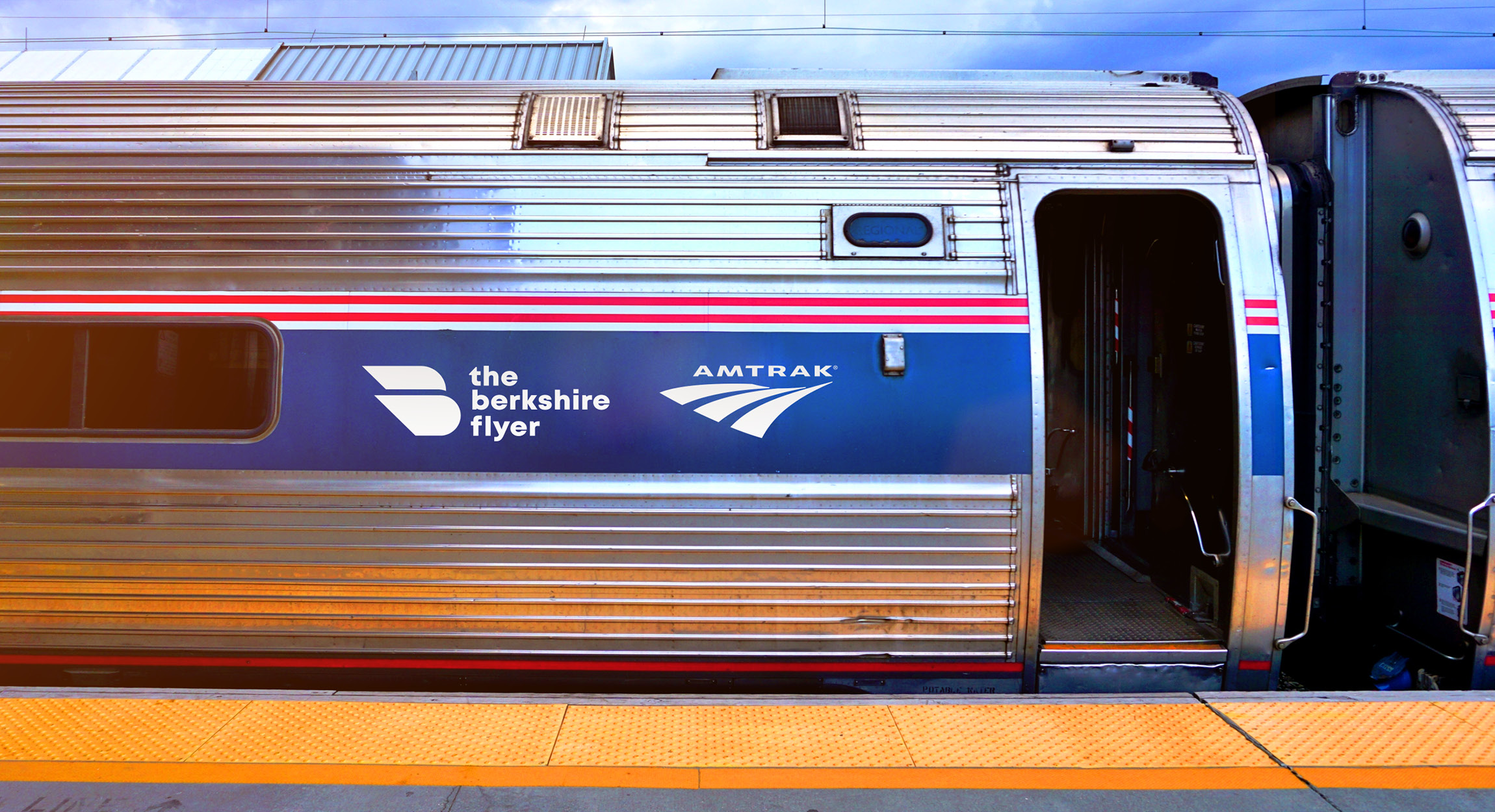
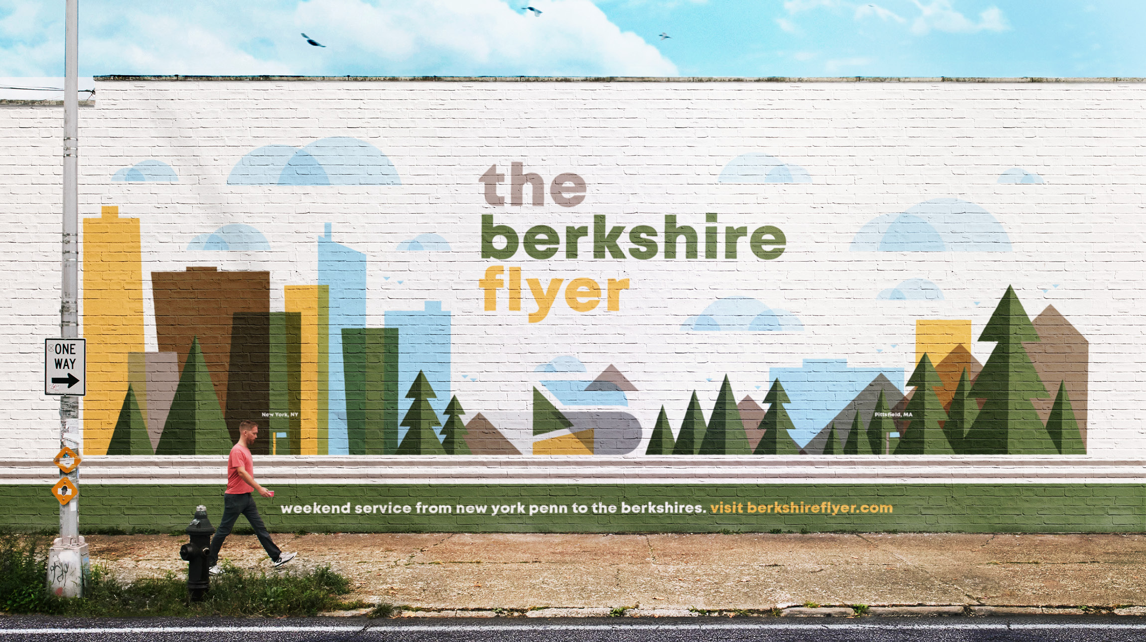
“The logo can scale into a large story for a wall mural in Williamsburg, or shrink to a small bug for the train ticket at the Amtrak kiosks in Penn Station,” said Dave Grasso, Senior Creative at BRIGADE. “It works comfortably within the cultural attractions in the region while standing out, and is as dynamic, fluid, and magnetic as the Berkshires themselves.”
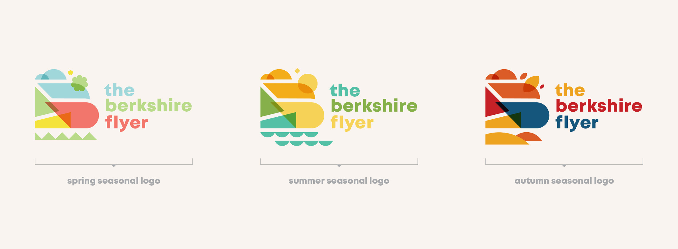
In addition to the hero identity, we created seasonal variations for the spring, summer, and fall. The Berkshires are geographically rich, so the seasons play a major role in how visitors experience the region. Seasonal logo variations offer visitors a sense of the changing landscape and remind them that a new experience awaits in the Berkshires — even if it’s just through the app icon changing on their phone’s home screen.
Beyond 1Berkshire’s seal of approval, the logo also needed support from state senators, the Massachusetts Department of Transportation, and the larger Berkshire Flyer board in order to move forward. Blending sophistication and friendliness helped the creative resonate with a variety of audiences, including these major stakeholders.
Strengthened by accessible branding that builds on the allure of the Berkshires as a thriving cultural and tourism center, the Berkshire Flyer is on track for a successful pilot program launch next summer.
Learn more about our work here.